THE PROCESS
1
Research
For the research phase of the project I used the following methods: Usability Tests, Depth Interviews, Online Survey & Benchmarking.
Usability Tests
I conducted 2 Usability Tests which consisted of an interview and the completion of tasks on 2 airline apps. I conducted the interview during COVID-19 lockdown, using Zoom to record the interview, and Reflector to mirror the apps onto the screen.
Usability testing was the perfect tool to utilise while conducting comparison tests as it allowed me monitor and probe real a user on real airline apps. This approach could tell me a lot about how the user flows through the journey, what pain points they had, what they would like to see improved and also of course, highlight any positive aspects I could take across to my design.
TASKS
- Book flight from Johannesburg to Amsterdam / Cape Town to London
- Dates: depart first Friday of June
- 11 nights for two people
-
“Okay, that's how that works. That seems a bit silly. Why would they.... I figured you would put in the departure date and the you would say select and it would take you to a new screen showing the return date.”
David Jones
Usability Test 1

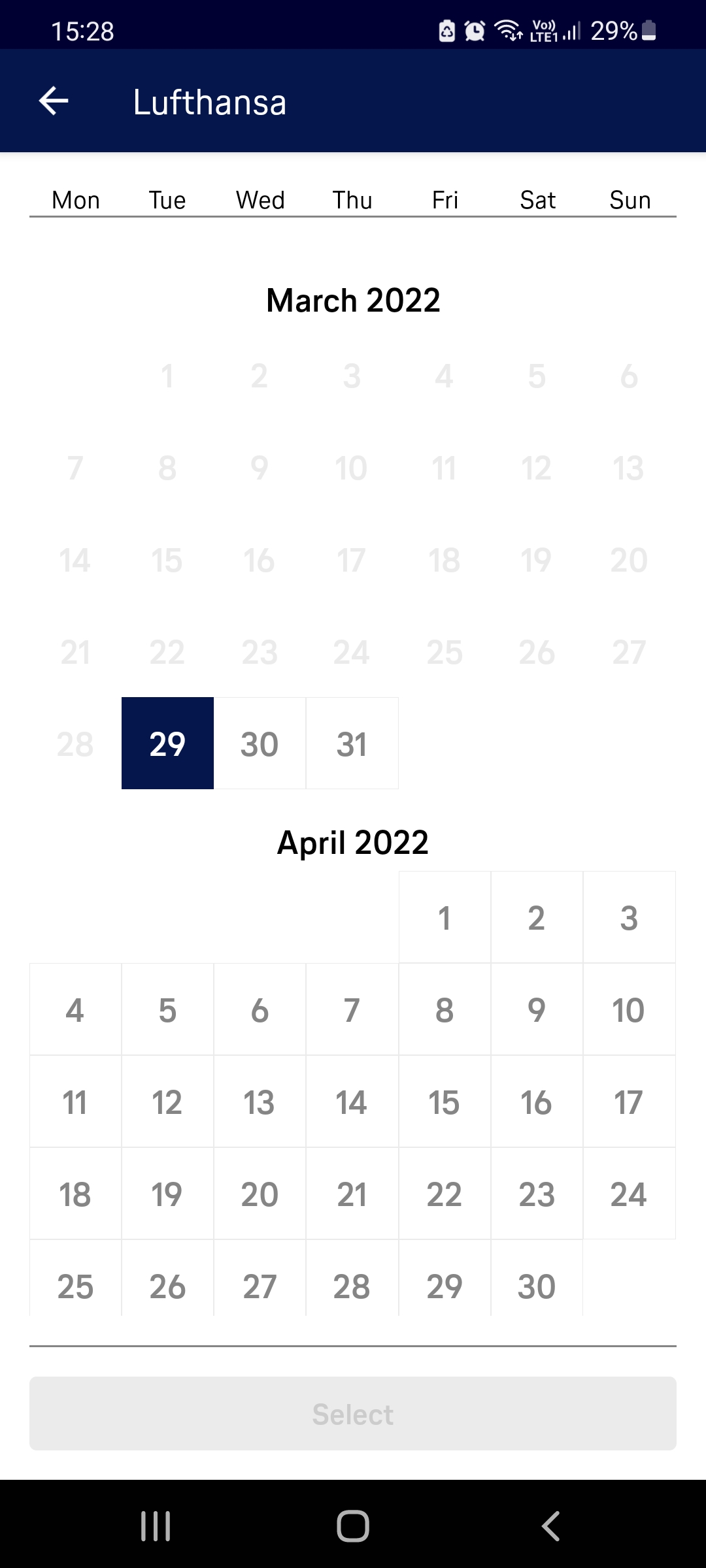
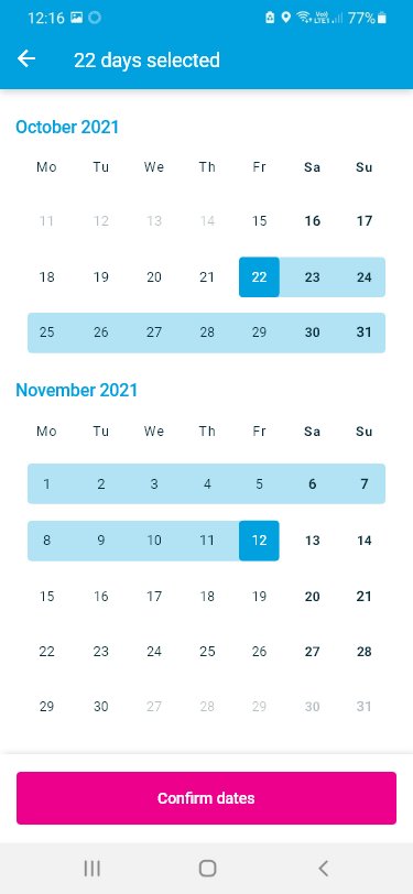
Date Selection
It became apparent that the date selection led to some confusion. There was a lack of feedback when dates were being selected which led users to be uncertain if they had chosen a date at all, especially on the outgoing selection.
-
“It doesn't seem to make much sense to me that they would, for your return trip, ask for Light or Standard. Because I would assume that you would come back with the same amount of luggage that you left with. That seems a bit redundant.”
David Jones
Usability Test 2

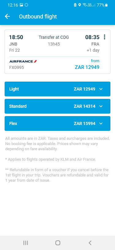
Flight Selection
Usability tests revealed that the additional information on flight fares is hugely important when selecting a flight. It's not just a "handy feature", it's what the user expects.
Depth Interview
I conducted a Depth Interview which consisted of questions relating to the user's occupation, where they live, their every day internet and app usage habits. I used this opportunity to probe further into past booking experiences and also expectations for booking apps. I conducted and recorded the interview over Zoom.

-
“Usually I would just go online and look for the cheapest flight and then depending on if it's on an app that I've already got, I'll just go onto the app and book it. But it depends on what I find on the internet first.”
Depth interviews gave me a better understanding of the context of use of people that use airline apps - what are they trying to do, who are they with, where are they, what devices are they use.
It validated my assumptions that there was a preference towards using their computer to make an airline booking as they felt they would be less inclined to make mistakes.
Survey
I sent out 1 Survey that was completed by 25 people. I used Survey Monkey for the form which consisted of 10 questions. To the get the maximum response, I outlined that there were just 10 questions and it would only take 3 mins. I used a mixture of open ended and closed questions.

The survey revealed that the primary motivation for choosing an airline was price and one of the main improvements users would look for is to make the steps clearer with less distractions.
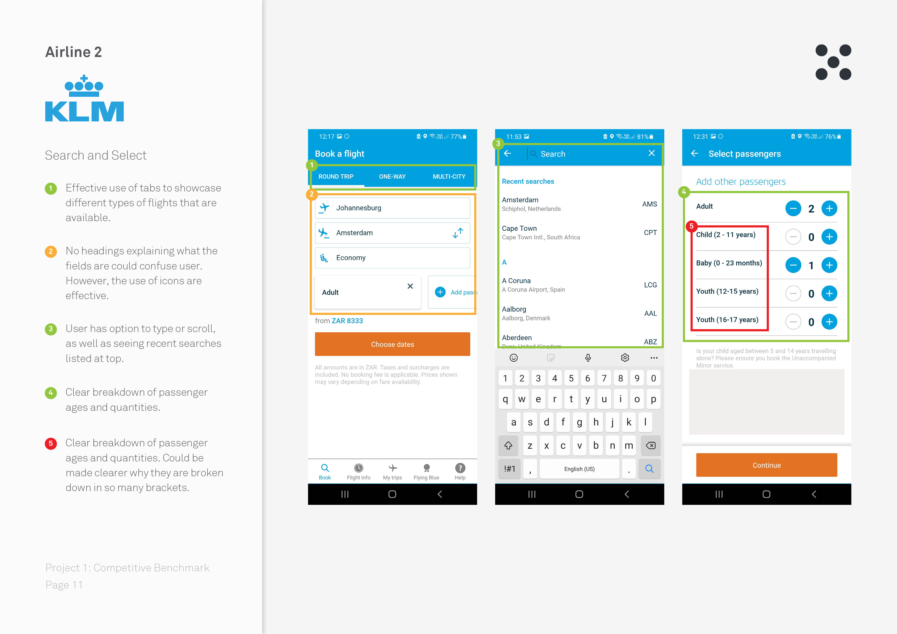
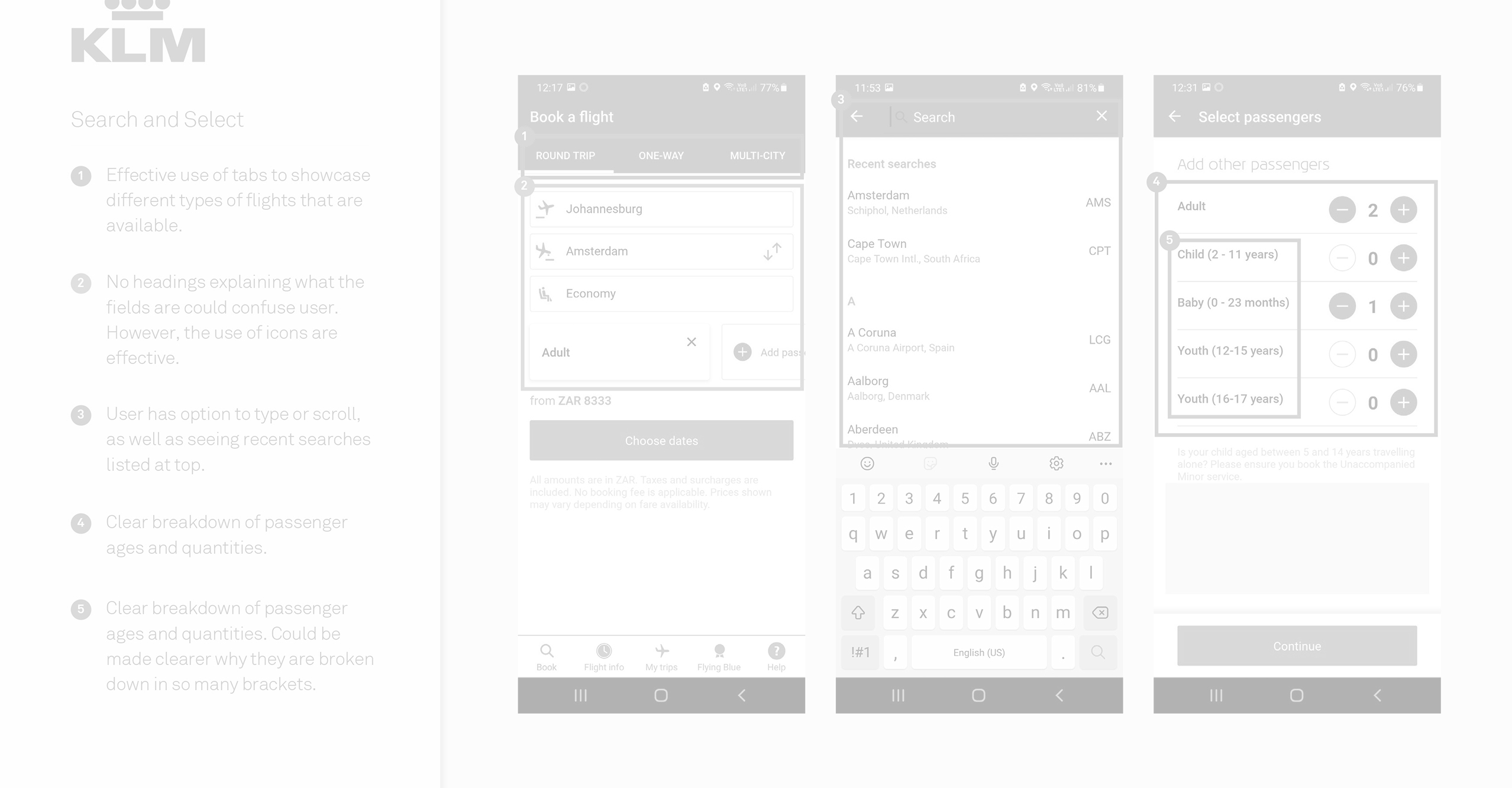
Competitive Benchmarking
During the Competitive Benchmarking phase I reviewed four mobile airline apps and benchmarked them to learn what they are doing well…and not so well so that I could emulate them in the right places and avoid the pitfalls I discovered in their booking process. My main objectives here were were to:
- Learn how best-in-class apps solve the problem we are trying to solve
- Understand the conventions we should follow
- Highlight best practice that we should emulate